
8 Creative And Helpful HTML5 Responsive Slideshow Selection For Your Next Web Design Project
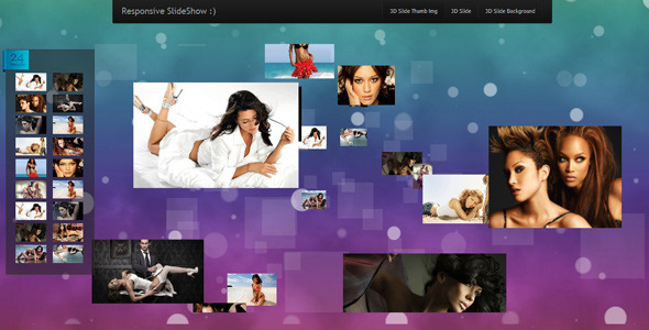
Bugibba SlideShow easy to use slider with awesome 3D transition effects.-2 type menu slideshow responsive.-1 type slideshow full screen
2. WOW Slider
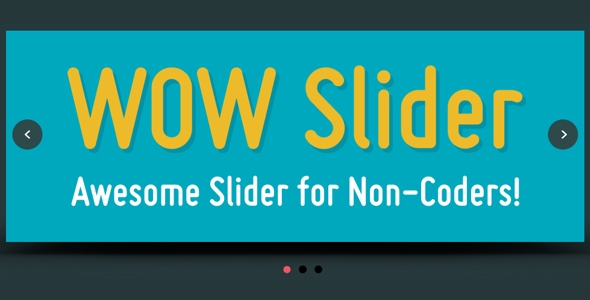
WOW Slider is a fantastic responsive image slider with
killer animations and tons of professionally made templates. NO Coding - WOW Slider is packed with a drag-n-drop wizard to create beautiful slideshows in a matter of seconds without coding and image editing. Wordpress plugin and Joomla module are available.
Also, you can share your slider on Facebook.
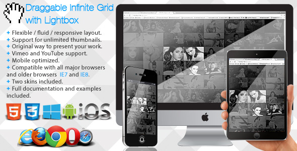
The Infinite Photo Grid with Lightbox has a fluid / flexible / responsive layout. The Infinite Photo Grid with Lightbox is using the GPU (hardware acceleration) using HTML5 standards. Slideshow button (optional). Slideshow delay, the delay of the slideshow can be set in seconds. Slideshow autoplay. Slideshow custom animated graphics.
It’s a solid, advanced and fully responsive jQuery plugin.HTML5 technology - this gallery uses the latest html5 tehniques to deliver a never seen before experience to your clients
slideshow mode – display images in a slideshow
responsive – looks great from mobile to HD
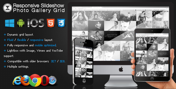
The Responsive Slideshow Photo Gallery has a fluid / flexible / responsive layout. The HTML5 responsive slideshow Photo Gallery is using the GPU (hardware acceleration) using HTML5 standards. Slideshow button (optional). Slideshow delay, the delay of the slideshow can be set in seconds. Slideshow autoplay. Slideshow custom animated graphics.
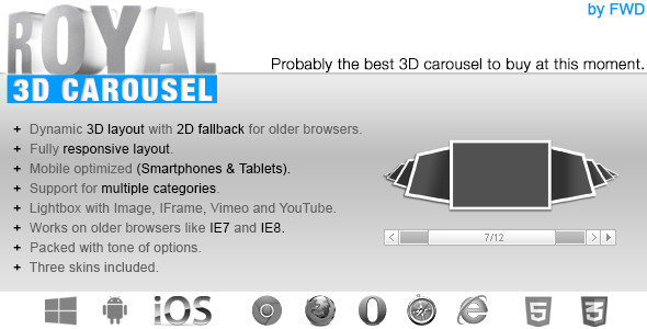
Fully responsive 3D carousel that allows to display media or HTML content inline with an unique and original layout. Two available display types: responsive / fixed and fluid width. Fully Responsive & Mobile Optimized (Smartphones & Tablets).
Even more important, it is fully responsive and mobile optimized and can take on any dimensions. It’s responsive, easy to use, safe, works in all modern browsers, gets constant updates, has great customer support, offers plenty of features and grants complete user control.Responsive
HTML5 Support to play self hosted videos
Slideshow Design
NEW Responsive modes
Responsive text
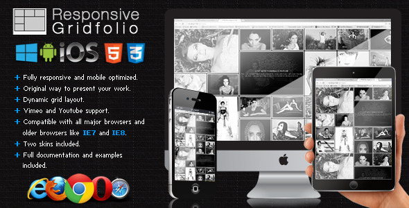
The Responsive Gridfolio has a fluid / flexible / responsive layout. The Responsive Gridfolio is using the GPU (hardware acceleration) using HTML5 standards. Responsive / Flexible / Fluid layout: you can control the size of the grid with CSS or JavaScript, basically it has an adaptable layout which makes it the perfect candidate for any type of project. Responsive / Flexible / Fluid layout: the lighbox will always fill the available browser viewport. Slideshow button (optional). Slideshow delay, the delay of the slideshow can be set in seconds. Slideshow autoplay. Slideshow custom animated graphics.
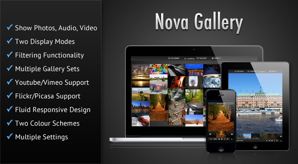
Nova Gallery is a HTML5 multimedia gallery enabling you to showcase your photos/audio/video in a beautiful and sleek interface. The gallery features a fluid responsive design and can fit in any screen size ranging from jQuery mobile slideshow to desktop browsers. Try the gallery demos and resize your browser to see the responsive design of the gallery in action. You can also have a slideshow of the items in the Full-width mode. This slideshow stops whenever the browser tab in which the gallery is displayed, goes out of focus (this feature only works in browsers that supports the HTML5 Page Visibility Api). Plays audio and video natively in modern HTML5 browsers and switches over to Flash/Silverlight for older browsers by using Mediaelement. True HTML5 Fullscreen option in supported browsers. The gallery features a fluid responsive design to account for various screens sizes ranging from mobile phones to desktop browsers and can also be placed in a container of any width. You can start the slideshow in Full-width mode when the gallery first loads. The time interval for which a particular item is visible during slideshow can be set. Also some of the modern HTML5 features such as Fullscreen and Page Visibility will only work in modern browsers.